Nick Nonnenmacher's Portfolio
Collection of Open Source GIS project work during Spring 2021
RE- Spatial-temporal and content analysis of Twitter Data
Replication of
Spatial, temporal and content analysis of Twitter data
Original study by Wang, Z., X. Ye, and M. H. Tsou. 2016. Spatial, temporal, and content analysis of Twitter for wildfire hazards. Natural Hazards 83 (1):523–540. DOI:10.1007/s11069-016-2329-6. and First replication study by Holler, J. 2021 (in preparation). Hurricane Dorian vs Sharpie Pen: an empirical test of social amplification of risk on social media.
Replication Author: Nick Nonnenmacher
Replication Materials Available at: nicknonnen/RE-Dorian
Created: 05 May 2021
Revised: 25 May 2021
Abstract
As more and more human beings are connected to each other and the world around them through social media platforms such as Twitter, more information about personal lives, the physical world, and the relationships that bind us together may be collected and stored in public repositories, available for researchers to utilize and apply to a wide range of new studies.
One new application is to assist in disaster aid, management, and research, as demonstrated by Wang et al. (2016) in their study on wildfires in California. There, it was concluded that “social media can characterize a disaster across space and over time” (Wang et al. 2016), meaning useful applications may be drawn from their analysis. To further support this, it was found people’s geographic awareness is very strong during disaster events, and that people were interested in communicating information regarding damage and the physical nature of the event as it unfolded.
In 2021, Holler replicated the methodology of Wang et al., with some modifications, to examine the effectiveness of using tweet data to track social media relationships with natural disaster events (here, Hurricane Dorian of August and September 2019) in the presence of false narratives proliferated by elite users. He found that original Tweets still clustered significantly along the real hurricane track, and only along the hurricane track.
Reproducing and replicating spatial research of social media-influenced big data remains relevant, and will only grow more so, because of the expanding nature of social media accessibility to human populations around the world, and the tendency of those populations to interact and use those social media platforms. These platforms are already used by billions (New York Times), so it can be assumed the data provided by scraping these databases will remain available for the foreseeable future.
In this replications study, I will validate the workflow created by Holler (2021) in the context of a new disaster situation. I have chosen to focus on the minor disaster event of May 2 - May 4, 2021, in a spate of southeastern and midwestern U.S. states, when 82 individual tornados were recorded.
Original Study Information
This study is a replication of Holler (2021)-which is itself a loose replication of the methods employed by Wang et al. (2016)-focusing on analyzing the effectiveness of using spatial Twitter data related to the landfall of Hurricane Dorian on the east coast of the U.S. mainland during the 2019 Atlantic hurricane season. The Wang et al. (2016) study focused on May 2014 wildfire events in the western U.S., and data was based on Twitter Search API queries for ‘wildfire’, ‘fire’, ‘San Marcos’, and ‘Bernardo’.
Holler modified Wang et al.’s methods by not searching for retweets for network analysis, focusing instead on original Tweet content with keywords ‘hurricane’, ‘Dorian’, or ‘sharpiegate’ (a trending hashtag referring to the storm). Holler modified the methodology for normalizing tweet data by creating a normalized Tweet difference index and extended the methodology to test for spatial clustering with the local Getis-Ord statistic. The study tested a hypothesis that false narratives of hurricane risk promulgated at the highest levels of the United States government would significantly distort the geographic distribution of Twitter activity related to the hurricane and its impacts, finding that original Twitter data still clustered only in the affected areas of the Atlantic coast in spite of false narratives about risk of a westward track through Alabama.
Wang et al (2016) conducted their study using the tm and igraph packages in R 3.1.2. Holler also used R, and utilized the rtweet, rehydratoR, igraph, sf, and spdep packages for analysis.
Materials and Procedure
The data for this lab was procured through a Twitter Developer account, which requires an application but is free of charge. All of our analysis was conducted in RStudio 1.4.1106, and the full code I used to complete this study may be found here.
First, I had to find an event to track. In the early days of May 2021, a minor natural disaster event was unfolding in some southeastern US states, predominantly Mississippi. There is already a robust Wikipedia article on the event, briefly summarizing the geographic location, path, and size of the 82 recorded tornados.
Next, I downloaded appropriate libraries and decided on four search parameters. I used the keyterms ‘tornado’, ‘Atlanta’, ‘mswx’, and ‘Txwx’, in order to collect a spread of tornado-related tweets in Georgia (where news sources lead me to initially believe the most storm events were - this was later observed to be incorrect, making the ‘Atlanta’ search term mostly irrelevant), Mississippi (‘mswx’ is a hashtag indicating Mississippi State Weather Extended tweets), and Texas (‘Txwx’ is a hashtag indicating Texas Weather Extended tweets, included because many initial ‘tornado’ tweets also contained this hashtag).
Here, search the Twitter Developer API for the most recent 200,000 tweets with any of your keyterms. In addition, I pulled any verified and unverified from a temporally distant timeline to provide baseline data for “typical” tweet activity in the same geographic area. This process may take up to two hours.
tornado <- search_tweets("tornado OR Atlanta OR mswx OR TXwx", n=200000, include_rts=FALSE, token=twitter_token, geocode="32,-78,1000mi", retryonratelimit=TRUE)

may <- search_tweets("-filter:verified OR filter:verified", n=200000, include_rts=FALSE, token=twitter_token, geocode="32,-78,1000mi", retryonratelimit=TRUE)
Once my tweets were downloaded and imported into R, I started to filter for more precise geographies. Then, I rehydrated those tweets I had selected to access full Tweets. Be sure to examine my code for a precise report of my workflow.
tornado_raw = rehydratoR(twitter_token$app$key, twitter_token$app$secret,
                        twitter_token$credentials$oauth_token,
                        twitter_token$credentials$oauth_secret, tornadoids,
                        base_path = NULL, group_start = 1)

may = rehydratoR(twitter_token$app$key, twitter_token$app$secret,
                        twitter_token$credentials$oauth_token,
                        twitter_token$credentials$oauth_secret, mayids,
                        base_path = NULL, group_start = 1)
Once the filtered tweet IDs and data were saved, I began my analyses. First, I conducted my temporal analysis with the following code, to produce Figure 1 below.
tornadoTweetsByHour <- ts_data(tornado, by="hours")
ts_plot(tornado, by="hours")
Next, I conducted my content and network analysis. The first codeblock below creates Figure _, and the second, Figure _.
tornadoText = tornado %>% select(text) %>% plain_tweets()
tornadoWords = tornadoText %>% unnest_tokens(word, text)

# count unique words before removing stop words
count(tornadoWords)
  # n = 142,342

data("stop_words")
stop_words = stop_words %>%
  add_row(word="t.co",lexicon = "SMART") %>%
  add_row(word="tornado",lexicon = "Search") %>%
  add_row(word="Atlanta",lexicon = "Search") %>%
  add_row(word="mswx",lexicon = "Search") %>%
  add_row(word="Txwx",lexicon = "Search")
tornadoWords =  tornadoWords %>% anti_join(stop_words)

# count unique words after removing stop words
count(tornadoWords)
  # n = 78,937

tornadoWords %>%
  count(word, sort = TRUE) %>%
  top_n(15) %>%
  mutate(word = reorder(word, n)) %>%
  ggplot(aes(x = word, y = n)) +
  geom_col() +
  xlab(NULL) +
  coord_flip() +
  labs(x = "Count",
       y = "Unique words",
       title = "Count of unique words found in tweets")
tornadoWordPairs = tornadoText %>%
  mutate(text = removeWords(tolower(text), stop_words$word)) %>%
  unnest_tokens(paired_words, text, token = "ngrams", n = 2) %>%
  separate(paired_words, c("word1", "word2"),sep=" ") %>%
  count(word1, word2, sort=TRUE)

tornadoWordPairs %>%
  filter(n >= 25 & !is.na(word1) & !is.na(word2)) %>%
  graph_from_data_frame() %>%
  ggraph(layout = "fr") +
  geom_edge_link(aes(edge_alpha = n, edge_width = n)) +
  geom_node_point(color = "darkslategray4", size = 3) +
  geom_node_text(aes(label = name), vjust = 1.8, size = 3) +
  labs(title = "Word Network of Tweets during Early May 2021 Southeast Tornados",
       x = "", y = "") +
  theme_void()
Finally, I could complete my spatial analysis. The first step of this analysis was signing up for a Census API at https://api.census.gov/data/key_signup.html (included in code provided above). With this access, I was able to obtain population data by county for specific states, identifying which with a FIPS code found on this Wikipedia site. Tweet locations normalized by population were then available to map, as seen in Figure 4 below.
ggplot() +
  geom_sf(data=counties_tornado, aes(fill=cut_number(DENSITY,5)), color="grey")+
  scale_fill_brewer(palette="GnBu")+
  guides(fill=guide_legend(title="Population Density"))+
  geom_point(data = tornado, aes(x=lng,y=lat),
             colour = 'purple', alpha = .2) +
  labs(title = "Tweet Locations During Early May Southeast Tornados")+
  theme(plot.title=element_text(hjust=0.5),
        axis.title.x=element_blank(),
        axis.title.y=element_blank())
The last step was a spatial join between tweet data and county data, and a calculation of Getis-Ord values to assign counties ‘hot’ or ‘cold’ values. Getis-Ord G* values were calculated with code from the first codeblock, while the second visualizes the data into Figure 5.
counties_tornado$locG = as.vector(localG(counties_tornado$torrate, listw = dwm_tornado,
summary(counties_tornado$locG)
siglevel = c(1.15,1.95)
counties_tornado = counties_tornado %>%
  mutate(sig = cut(locG, c(min(counties_tornado$locG),
                           siglevel[2]*-1,
                           siglevel[1]*-1,
                           siglevel[1],
                           siglevel[2],
                           max(counties_tornado$locG))))
rm(siglevel)
ggplot() +
  geom_sf(data=counties_tornado, aes(fill=sig), color="white", lwd=0.1)+
  scale_fill_manual(
    values = c("#0000FF80", "#8080FF80", "#FFFFFF80", "#FF808080", "#FF000080"),
    labels = c("low","", "insignificant","","high"),
    aesthetics = "fill"
  ) +
  guides(fill=guide_legend(title="Hot Spots"))+
  labs(title = "Clusters of Early May Southeast Tornado Twitter Activity")+
  theme(plot.title=element_text(hjust=0.5),
        axis.title.x=element_blank(),
        axis.title.y=element_blank())
The exact code for this complete analysis may be found here. When replicating, be sure to substitute ‘tornado’ with the data of your twitter scrape with keywords, and ‘may’ with data from a non-focused complete scrape of the same geographic, but temporally distant, extent.
Replication Results
The results of this analysis sought to capture a holistic representation of the rehydrated Twitter data, by visualizing tweet activity in temporal, network, content, and spatial dimensions. For the temporal analysis, we represented tweet activity by hour in Figure 1. The content and network analysis consisted of finding the top 15 most frequently-seen unique words in the poo of tweets, and then creating the word cloud seen in Figure 3, where unique words commonly found together in tweets are linked by lines. The thicker and darker the lines, the more frequent that pair was.
Finally, we joined the tweet data was county geometry data to map Twitter activity by population (Figure 4) and by hotspot clusters (Figure 5). Mapping by population illustrates where the most Twitter activity was occurring, normalized by population, and mapping by hotspot cluster illustrates where abnormally high or low Twitter activity may be found, normalized by the Twitter activity of a temporally distant timeline.
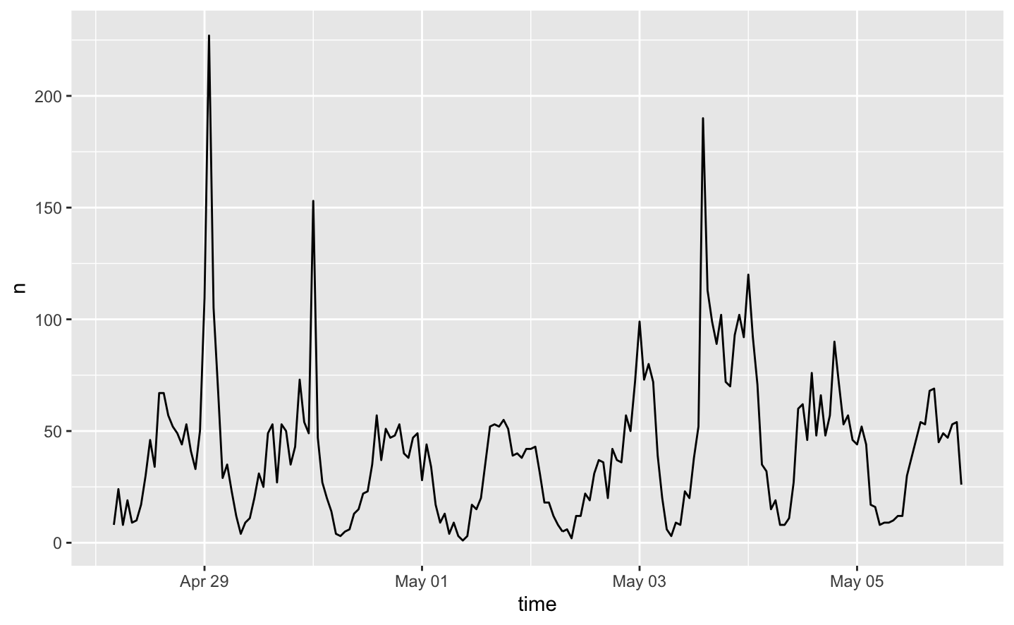 Figure 1. A measure of tweets per hour in the southeastern US, in late April and early May 2021.
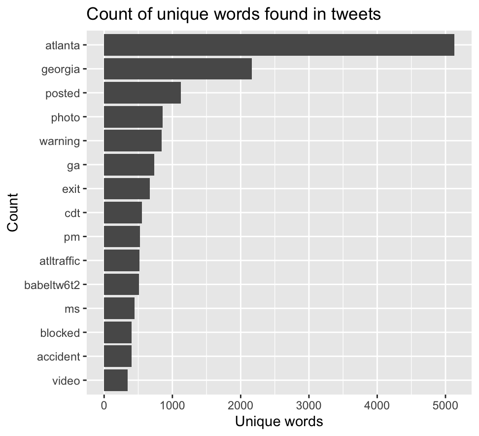 Figure 2. Count of unique words in tweets produced in the southeastern US, in late April and early May 2021.
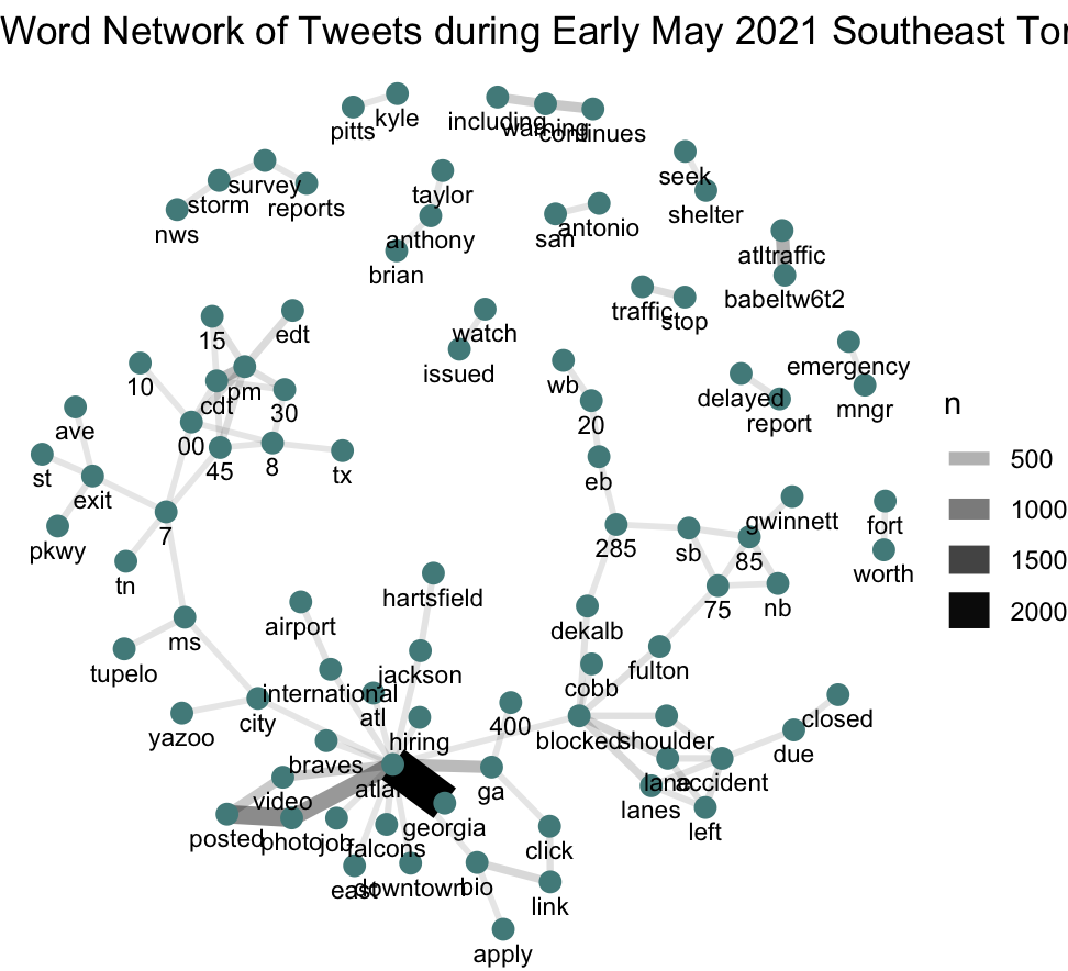 Figure 3. A word cloud network of unique words in tweets produced in the southeastern US, in late April and early May 2021.
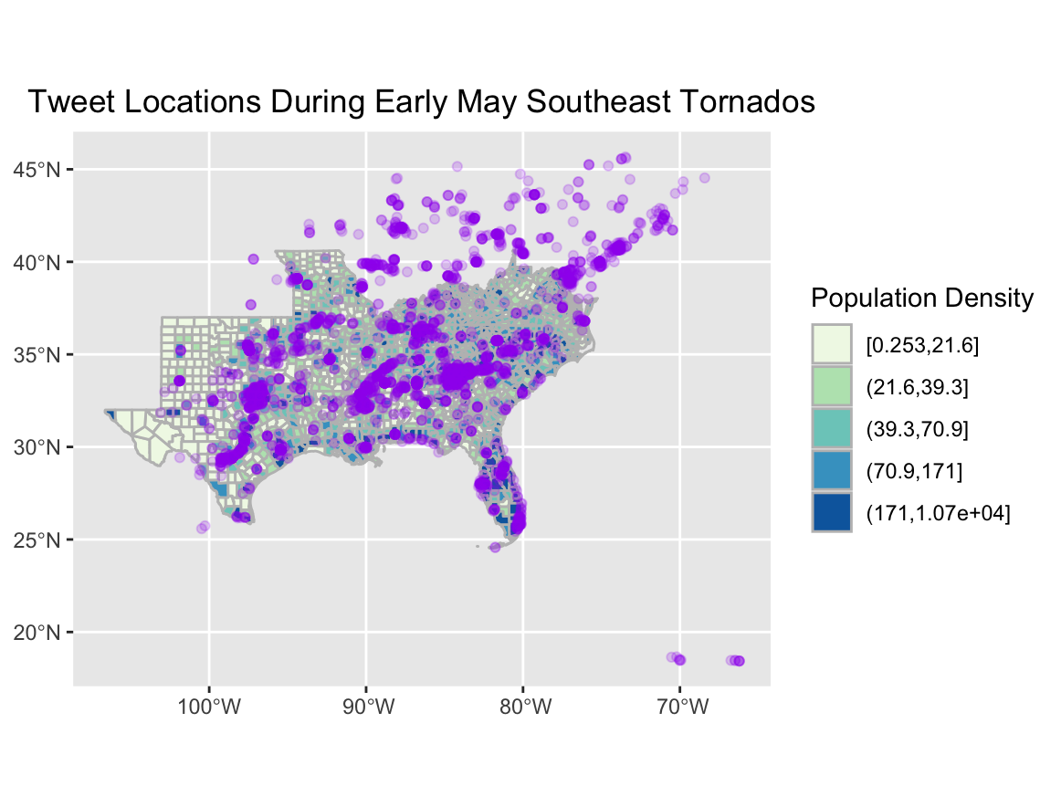 Figure 4. Visualizing tweet activity by population per county in the southeastern US, in late April and early May 2021.
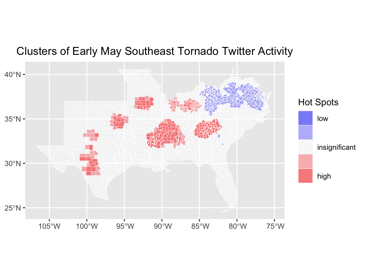 Figure 5. Visualizing hot spot clusters where tweets related to the Southeast Tornado event were particularly high or particularly low.
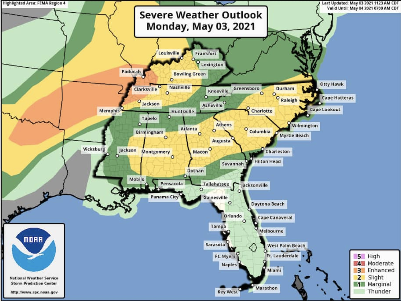 Figure 6. The National Weather Service Storm Prediction Center’s Severe Weather Outlook for the May 3 2021 tornados. Yellow and Orange represent highest risk of severe weather, and green and beige represent marginal risk and thunder.
Unplanned Deviations from the Protocol
Fortunately, this analysis did not suffer any significant unplanned deviations from the replication protocol prepared by Joe Holler in 2019. However, during my initial run-through of this code after debugging and refining code, I realized I had forgotten to include data from a temporally distant timeline with which I could compare tornado-related Twitter activity during early May. To remedy this, I ran another data pull on the morning of May 11th, 2021 (6 days after my initial pull), to access and include any verified and unverified tweets from the same geographic region. I was then able to effectively incorporate this data back into my code using the scaffold provided by Professor Holler and complete my analysis as an accurate replication.
While not necessarily an unplanned deviation from protocol, this replication effort did diverge from the original studies in one notable way: while collecting tweets with the four keywords ‘tornado’, ‘Atlanta’, ‘mswx’, and ‘Txwx’, I structured my query in such a way that tweets with any of those four words would appear in my dataset. This was done by placing an ‘OR’ between each term, instead of an ‘AND’ after tornado and an ‘OR’ in between the remaining three. As a consequence of this semantic error, the tweets I analyzed could have been pertaining to anything related to any of those four terms, not specifically tornados. This was likely the cause of the high volume of Atlanta-related tweets seen in Figure 3, discussed below. If this issue occurs in future replications or studies involving Twitter data, it is possible to filter collected data using the dyplr library.
Discussion
The results of my temporal analysis reflect Twitter activity related to any of my four keywords from April 28th to May 6th, 2021. The dips represent nighttime, and the various peaks represent daytime; the tallest peaks likely represent severe weather events. The first peak on April 29th likely correlates to the final events of a previous tornado outbreak, and is closely followed by another peak on May 3rd. It seems, from this graph as well as various news reports from local weather stations, the area was hit with multiple severe outbreaks in the span of only a few days, and Twitter activity jumped whenever the danger was greatest.
The content and network analysis shine more light on this conclusion. As seen in Figure 2, some of the most frequently-seen words are ‘atlanta’, ‘georgia’, ‘warning’, ‘exit’, ‘blocked’, and ‘accident’ - all words that associate with danger and communication that makes content in light of a disaster event. Some of the word pairs in Figure 3 support this further; associated pairs include ‘seek-shelter’, ‘nws-storm-survey-reports’, ‘watch-issued’, ‘emergency-mngr’, and ‘delayed-report’. It appears that of the tweets posted in this time frame and geographic extent, some were using the platform to communicate updates and warnings regarding the surrounding danger. This is not the case for all of the tweets - there are a significant amount of unrelated networks, such as ‘atlanta-hiring’, ‘atlanta-braves’, and ‘anthony-taylor-brian’. It is important to note, however, that many of the tweets included in this analysis were solely related to Atlanta, and the aforementioned pairs were likely byproducts of this accidental inclusion of tweets. Fortunately, while their presence does crowd out some of the more relevant tweets, they do not inhibit or invalidate the analysis of the tornado-related tweets.
In Figures 4 and 5, a spatial pattern emerges that connects the findings of the temporal and content analyses. Figure 4 displays tweet density of relevant tweets in the specific timeframe, and when compared to the actual predicted path of storms from the NWS Storm Prediction Center, higher density areas align relatively closely with NWS highest-risk corridors. This pattern is seen again in Figure 5, where darker red counties represent hot spots for relevant Twitter activity - again, sharing a high degree of similarity to both the predicted path of the storms, and the density of tweets being posted.
These findings reveal three major outcomes. Relevant tweets contain warnings and communications related to the ongoing disaster event; tweets are highest in volume around the times of disaster events; and tweet hot spots and high density areas are spatially arranged very close to the path of the actual storms. Considered together, it is evident that Twitter activity did accurately represent the spatial, temporal, content, and network dimensions of these storms. This leads me to conclude that conclusions drawn by Holler (2021) and Wang et al. (2016) are valid and correct, and that Twitter data can be safely and effectively used by researchers, emergency relief services, and administrators to aid, manage, and study disaster-affected populations and regions.
Conclusion
As social media platforms continue to collect mass amounts of user-provided public information about relationships between users and the physical world around them, the scientific community must develop and practice new epistemologies for using and analyzing big data. Concerns surrounding the ethics of using social media-provided big datasets have already been raised (Crawford and Finn 2014) and have yet to be adequately addressed by the greater geospatial scientific community, but there are ways to responsibly and respectfully handle this data and draw valid and useful conclusions.
This data can serve particularly effective use when it comes to aiding, managing, and studying natural disaster events. This study replicates, and in its conclusions validates, Holler (2021) in his effort to analyze if Twitter data surrounding both the true and falsely-claimed landfall of Hurricane Dorian accurately represented the spatial, temporal, content, and network dimensions of the physical event. In his study, Holler concludes Twitter activity did illustrate the true movement and timing of the storm, and that tweet content contained relevant warnings and communications pertinent to other people attempting to flee from danger.
Holler’s study was itself a loose replication of Wang et al. (2016), which focused on 2014 wildfire events in California, and concluded similar results. This study, which focuses on 2021 tornado storm events in the southeastern U.S., confirms the conclusions of both studies and therefore provides further support that social media data scraped from public platforms such as Twitter can provide accurate and informative information for future natural disaster research and management.
As the production of big datasets through social media platforms continues to evolve, and as a changing climate influences more and more disaster-level storm events that affect more and more human populations, more research will need to be conducted to maintain the validity of these results. Research pertaining to the usefulness and accessibility of big data from other platforms, such as Facebook or Instagram, could also be effective in illustrating a more complete picture of how social media data influences human interactions with natural disaster or crists events.
References
Cappuci, M. 2021. Severe weather threatens millions in Plains and South after damaging tornados in Mississippi, Georgia. The Washington Post, May 03. Access May 11, 2021. https://www.washingtonpost.com/weather/2021/05/03/mississippi-tornadoes-severe-thunderstorm-threat/
Crawford, K., and M. Finn. 2014. The limits of crisis data: analytical and ethical challenges of using social and mobile data to understand disasters. GeoJournal 80 (4):491–502. DOI:10.1007/s10708-014-9597-z.
Isaac, Mike. 2021. Facebook posts a 33 percent increase jump in revenue and a 53 percent jump in profit. New York Times, Jan 27. Accessed May 11, 2021. https://www.nytimes.com/2021/01/27/business/facebook-earnings.html.
Jimenez, J. 2021. Severe Weather Threatens South as Tornados Tear Across 4 States. New York Times, May 03. Accessed May 11, 2021. https://www.nytimes.com/2021/05/03/us/tornadoes-mississippi-atlanta.html
Storm Prediction Center, NOAA’s National Weather Service. https://www.spc.noaa.gov/wcm/
Wang, Z., X. Ye, and M. H. Tsou. 2016. Spatial, temporal, and content analysis of Twitter for wildfire hazards. Natural Hazards 83 (1):523–540. DOI:10.1007/s11069-016-2329-6.
Report Template References & License
This template was developed by Peter Kedron and Joseph Holler with funding support from HEGS-2049837. This template is an adaptation of the ReScience Article Template Developed by N.P Rougier, released under a GPL version 3 license and available here: https://github.com/ReScience/template. Copyright © Nicolas Rougier and coauthors. It also draws inspiration from the pre-registration protocol of the Open Science Framework and the replication studies of Camerer et al. (2016, 2018). See https://osf.io/pfdyw/ and https://osf.io/bzm54/
Camerer, C. F., A. Dreber, E. Forsell, T.-H. Ho, J. Huber, M. Johannesson, M. Kirchler, J. Almenberg, A. Altmejd, T. Chan, E. Heikensten, F. Holzmeister, T. Imai, S. Isaksson, G. Nave, T. Pfeiffer, M. Razen, and H. Wu. 2016. Evaluating replicability of laboratory experiments in economics. Science 351 (6280):1433–1436. https://www.sciencemag.org/lookup/doi/10.1126/science.aaf0918.
Camerer, C. F., A. Dreber, F. Holzmeister, T.-H. Ho, J. Huber, M. Johannesson, M. Kirchler, G. Nave, B. A. Nosek, T. Pfeiffer, A. Altmejd, N. Buttrick, T. Chan, Y. Chen, E. Forsell, A. Gampa, E. Heikensten, L. Hummer, T. Imai, S. Isaksson, D. Manfredi, J. Rose, E.-J. Wagenmakers, and H. Wu. 2018. Evaluating the replicability of social science experiments in Nature and Science between 2010 and 2015. Nature Human Behaviour 2 (9):637–644. http://www.nature.com/articles/s41562-018-0399-z.